Economagic.com
Since so much of business planning requires taking economic and market conditions into account, it's handy to know of a data portal like economagic.com that provides searchable access to tens of thousands of data sets from such sources from the US Census Bureau, Bureau of Labor Statistics, and Federal Reserve.In addition to linking you to a wealth of data series, economagic.com enables you to work with the data in various ways, including:
- producing line charts
- running regressions
- creating scatter plots

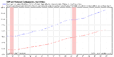
To create the chart, I followed these steps:
- At the economagic.com home page, I clicked on "Turn Advanced Features On" at the top of the screen.
- Out of curiosity, I clicked on "Most Requested Series" at the top of the list of data collections.
- I clicked on Real Gross Domestic Product (GDP).
- In the orange horizontal menu above the data series, I clicked on "Save Series to Personal Workspace."
- I returned to the Most Requested Series page and clicked on Real Personal Consumption Expenditures.
- In the orange horizontal menu above the data series, I clicked on "Save Series to Personal Workspace."
- In the orange horizontal menu at the top of the screen, I clicked on "View Workspace."
- In the "Chart Multiple Series in a GIF/PDF Chart" section of the workspace page, I clicked on the "Click here to start" button.
- From the "Select Series #1" drop-down menu, I selected the real GDP item.
- From the "Select Series #2" drop-down menu, I selected the real Personal Consumption Expenditures item, and then clicked the "Continue" button.
- For both the GDP series and the Consumption Expenditures series, I chose "Left" in the "Scale" drop-down menu. This meant that the vertical axis of my chart would show dollar amounts for the two series, as opposed to being left completely unlabeled. (The horizontal axis is automatically labeled with the years that the data cover.)
- In the "Chart Title" field, I entered "GDP and Personal Consumption, real dollars." (You can give your chart whatever title you like.)
- I clicked on the radio button for "Show recessions." This caused my chart to mark periods of recession with vertical pink bars. (See the image above.)
- I clicked on the radio button for "Show grid." This caused my chart to show vertical and horizontal grid lines, making it easier to read the dollar amounts corresponding to any particular year.
- I left all other items (e.g., Gif height and Gif width) at their default values, and clicked on the "Make Chart" button.
This is just one example of what you can do with economagic.com. You can see some other interesting examples in this recent entry in Berkeley economic professor Brad DeLong's blog. The key point is that the data and the charting tools are readily available and can be very helpful to you in analyzing economic trends that affect your business.
Labels: Business acumen
<< Home