Edward Tufte on the Visual Display of Information
Edward Tufte, a professor of political science, statistics, and computer science at Yale, defines state of the art when it comes to using graphs and other visual tools to present information. His first book on the subject, The Visual Display of Quantitative Information, was published in 1983, with a second edition coming out in 2001.I recommend this book to anyone interested in learning the finer points of communicating quantitative information clearly and cleanly. As a very brief overview, I've listed below the six design principles Tufte promotes. A more complete summary of his work (with specific reference to Web design) can be found here.
Tufte's design principles:
- Document the sources and characteristics of the data you cite.
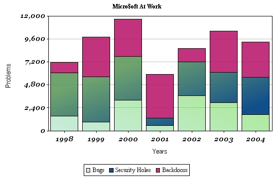
- Enforce appropriate comparisons. E.g., stacked bar charts, such as in the example below, should be used with caution because often only the bottom segments are readily compared by eye.
- Demonstrate mechanisms of cause and effect.
- Express mechanisms of cause and effect quantitatively.
- Recognize the inherently multivariate nature of analytic problems (i.e., don't oversimplify your description of cause and effect).
- Inspect and evaluate alternative explanations.

While you're checking out what Tufte has to say about presenting evidence, you might also want to take a look at his essay, The Cognitive Style of PowerPoint. In this essay, Tufte explains why PowerPoint presentations generally fall pitifully short when evaluated against the above principles.
Tufte has continued to publish books on the visual display of information. Envisioning Information came out in 1990, followed by Visual Explanations: Images and Quantities, Evidence and Narrative in 1997. His latest book, Beautiful Evidence, came out this month.
Labels: Documentation, Usability
<< Home